Two weeks ago, we realized our original name, Infamous, wasn’t a good fit for the kind of product we were trying to build. Rather than whimsical and creative, like a storytelling app should be, it sounded rather sinister. To address this, we held a brainstorming session and almost picked the name Raconteur before realizing that none of us really knew how to pronounce it. However, we still liked the connection to storytelling, so when Simon suggested the name Aesop, we all loved it! Short, sweet, and meaningful, it captured exactly the vibe we were going for. (Luckily, it’s still a good fit for yesterday’s pivot to dynamic, meaningful mobile templates!)
Until yesterday, however, we hadn’t updated the rest of our identity to fit with the new name. With the Pink Bagel presentations on the horizon, we decided that now was the time. As we brainstormed ideas for our new logo, Simon brought up a style of Chinese watercolor/brush painting that we are both fans of as a storytelling medium. For an example of this style, check out the video below, a short and beautifully painted love story:
Inspired by this art style, we decided to check out fonts that captured this sort of style. A quick Google search revealed a series of freely available brush fonts available on dafont.com:

Almost immediately, our eyes were drawn to the third font in the image above, Olivier. After browsing several pages of fonts, we unanimously agreed that it was the one. Olivier is free for personal and educational use, but an important thing to remember if we ever decide to monetize the product is to buy a license for commercial use – it’s only $35 for a single-user license, so it certainly won’t break the bank!
Moving on to the design process, we looked at a number of other startup logos and decided we like the modern, minimalist style of text-only logos. With this decided, we moved to Photoshop to experiment with colors. Our first instinct was to experiment with blues and grays, which produced the below color palette:

We were getting pretty fond of the seafoam green above before I thought of the Color Emotion Guide, an infographic we had discussed during a product branding Arts Intensive I participated in two years ago.
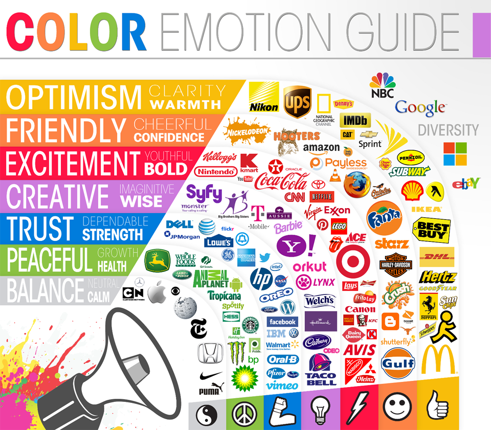
The guide, which relates colored logos to the types of emotions they evoke in viewers, contained an obvious match for our product: Purple, the color of creativity and imagination. In particular, Simon honed in on the Hallmark purple as a rich, eye-catching shade. We experimented with a few varieties of purple and eventually decided that we liked hex code #80568e the best, producing the following logo:
![]()
Finally, we turned to the final step in the logo-design process: the small, square version used when there isn’t space for the whole thing, as in Facebook avatars. Inspired by Pinterest’s P logo, we tried embedding our “aesop a” into a circle in a few different fashions, as can be seen below. Though we were initially hesitant to pick a logo that resembled Pinterest’s too strongly, we eventually went with the left-most version for its bold simplicity.


With that, we were ready to launch! Our logo can be seen on our blog and in the Facebook ads that we’ll be running over the course of the next week. Given how quickly we designed it, if we decide to push our product in a more professional direction, we may want to hire a professional logo designer or branding company. For now, however, this is the new face of our brand.
We’ll be blogging about the Pink Bagel campaign in a week’s time, once we’ve collected and analyzed our data. Stay tuned!
-Grace
